How Many Colours Should You Have In A Room: A Practical Design Rule
When you decorate a room, you may wonder how many colors work best. Clear guidelines can help you make choices that feel balanced and easy on the eyes.
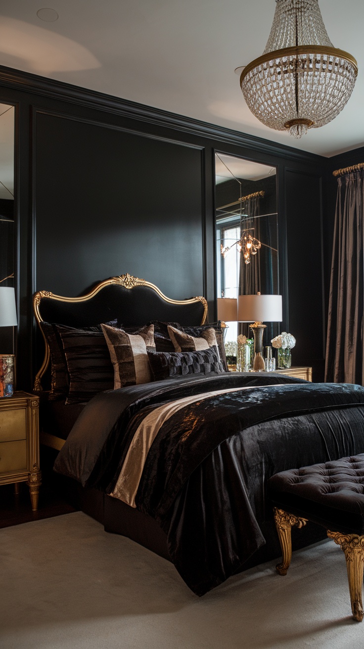
Design experts often suggest using three colors in one room. You can apply them with the 60-30-10 rule, where one main color fills most of the space, a second color supports it, and a small accent adds contrast and interest.
Why limit your palette to three colours?
You use the three-colour rule to keep a room clear and calm. When you limit your choices, your space feels planned instead of random. Too many colours fight for attention and make a room feel busy. Too few can feel flat and dull.
This rule helps when you feel stuck. You choose one main colour, one support colour, and one small accent. You then repeat them in different shades and textures. This creates flow without forcing a perfect match.
You do not need strict rules forever. As you gain skill, you can add more colours with care. Until then, this approach gives you control and confidence. It also saves time and avoids costly mistakes.
Many designers pair this idea with a balance guide. Some call it 60–30–10 or 70–20–10. The idea stays the same.
- Main colour: covers most of the room, often walls or floors
- Second colour: supports the main one, often furniture
- Accent colour: adds contrast in small touches

Your main colour often stays neutral. This gives your eye a place to rest. Your accent colour acts as a break so the room does not feel safe or boring.
You can also vary tone, not just colour. Light and dark versions of the same colour count as one. This lets you add depth without breaking the rule.
A practical three-colour setup in a room
You can see how this works in a real space. The example below shows how three colours play clear roles without clashing.
| Role | Colour choice | Where you use it |
|---|---|---|
| Main | Soft blue with grey tone | Walls or large surfaces |
| Secondary | Deep brown | Sofa or large furniture |
| Accent | Dark red | Lamp or small décor |
You start with a calm blue on the walls. It sets a relaxed mood and fills most of the space. The grey tone keeps it grown-up and easy to live with.
You then add a deep brown sofa. This grounds the room and adds warmth. Brown pairs well with blue because it feels natural and stable.
You finish with a dark red lamp. You use it in a small dose so it stands out. This colour adds energy without taking over.
You can repeat these colours in pillows, art, or rugs. You just keep each item tied to one of the three choices. This keeps the room connected and easy on the eye.
You stay free to adjust shades and textures. The rule guides you, not traps you.
Can you use more than three colours?
You can use more than three colours if you plan them with care. Think of three colours as a base, not a limit. Once you feel comfortable, you can add more shades without losing balance.
Many designers still start with a simple structure. One colour leads, another supports it, and a third adds contrast. A common method uses 60% main colour, 30% support colour, and 10% accent. This approach keeps the room clear and easy to read, even when you add extra tones.
You can expand your palette in smart ways that still feel calm:
- Use different tones of one colour, such as light, medium, and dark blue
- Pick neighbouring colours on the colour wheel, like green and blue
- Add depth with soft neutrals, such as cream, grey, or warm white
These choices let you layer colour without sharp clashes. The room feels richer, not louder.
New colour trends also support using more than three colours. Colour drenching covers walls, trim, and even ceilings in the same shade. Double drenching builds on that idea by pairing two close colours across many surfaces. You create a smooth flow that feels full and settled, not busy.

When you push past three colours, limits still matter. Most experts agree that more than five colours in one room often feels like too much. Too many strong colours compete for attention and make the space feel restless.
This table shows a simple way to think about colour count:
| Number of colours | How it feels | Best use |
|---|---|---|
| 2–3 | Clean and focused | Small rooms, calm spaces |
| 4–5 | Layered and personal | Living rooms, creative spaces |
| 6+ | Busy and crowded | Usually best avoided |
If you love bold looks, stay within one colour family or balance strong shades with neutrals. This approach gives you freedom while keeping the room easy to enjoy.
Do different tones or shades count as different colours?
Whether you treat tones or shades as separate colours depends on how different they look to your eye and how you plan to use them. In many spaces, small changes within one colour family read as the same colour, not new ones.
If you use very similar versions of one colour, your eye groups them together. For example, two deep greens that sit close together on a paint chart will usually feel like one colour in a room. Texture, finish, or material may add interest, but the colour still feels unified.
In this case, you often need other colours to create contrast. When tones differ only a little, they do not add enough visual change on their own. Your brain reads them as a single colour block.
Other people see it differently. Strong changes in tone or shade can make the same base colour look new. Adding black makes a colour darker. Adding grey makes it softer and less bright. These changes can shift how the colour feels and behaves in a space.
A dark, muted blue can feel serious and heavy. A lighter, cleaner blue can feel open and calm. Even though both come from the same base colour, they may not feel related at first glance.
You can think about tones and shades in simple terms:
| Term | What changes | What you notice |
|---|---|---|
| Tint | Add white | Colour looks lighter |
| Tone | Add grey | Colour looks softer |
| Shade | Add black | Colour looks darker |
When the change is strong, many people count these as different colours. When the change is subtle, most people do not.
How you use them also matters. You can use light tones to push walls back and make a room feel larger. Darker shades pull surfaces forward and add weight. Using several tones of one colour can change how tall, wide, or close a space feels.
Your own colour sensitivity plays a role too. If you work with colour often, you may notice hidden hints, such as blue or purple within a grey. Other people may miss these shifts and see only “grey.”
Light changes everything. Natural daylight, warm bulbs, and shadows can all alter how a tone appears. A colour that looks flat in one room may look rich in another.
When you choose colours, test them together in the space. Ask yourself these questions:
- Do the colours look clearly different from a distance?
- Do they create contrast, or do they blend?
- Do they support the mood you want?
Your answer helps you decide whether tones or shades count as one colour or many in your space.